Tashoi
Sequential Art, Character Design, Illustration.
Sequential Art, Character Design, Illustration.
I'm Tashoi, an 18 year old hispanic art student. I'm currently a Fine Arts Major.

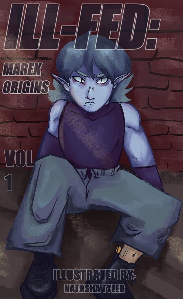
ILL-FED Cover

Buggin Out

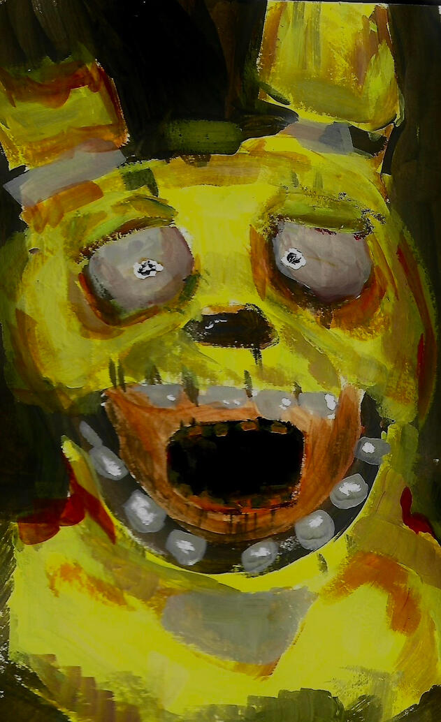
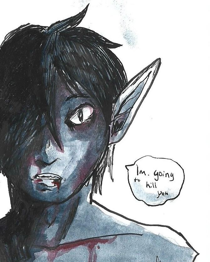
Trapped

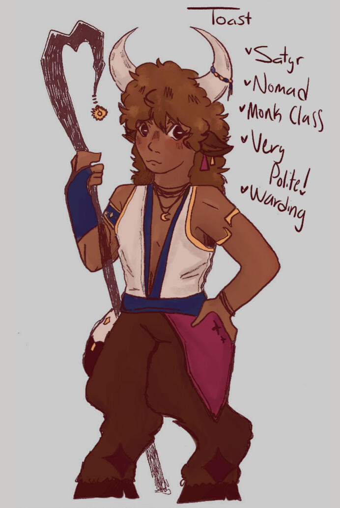
Toast Design

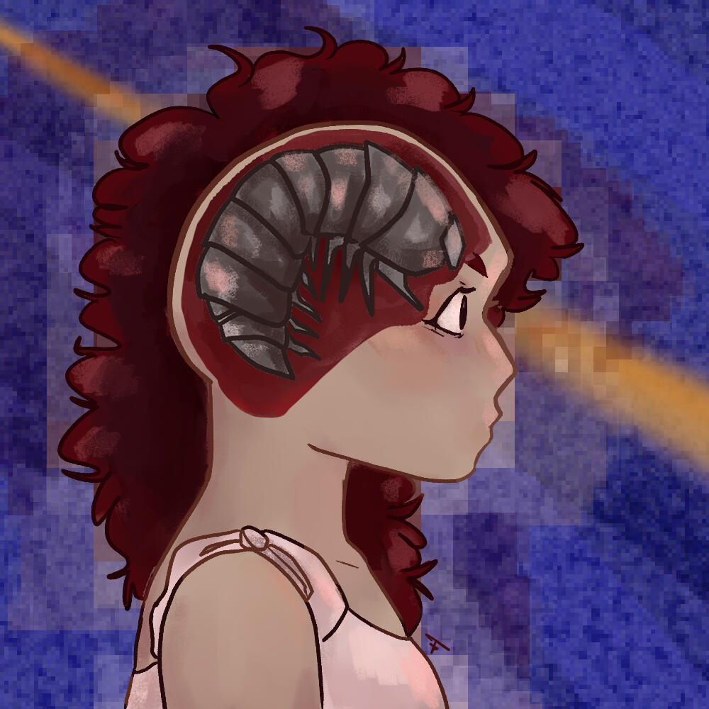
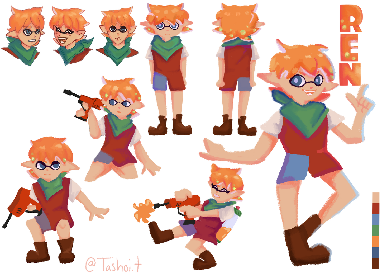
Ren Design

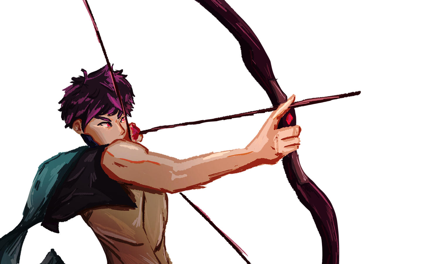
Marek Panel

Everyone Shines

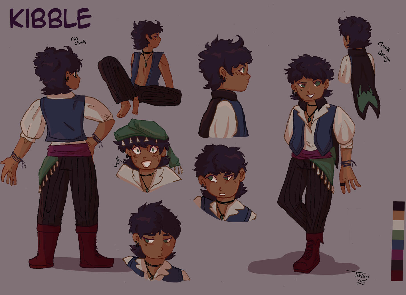
Kibble Sheet (Crunched File)

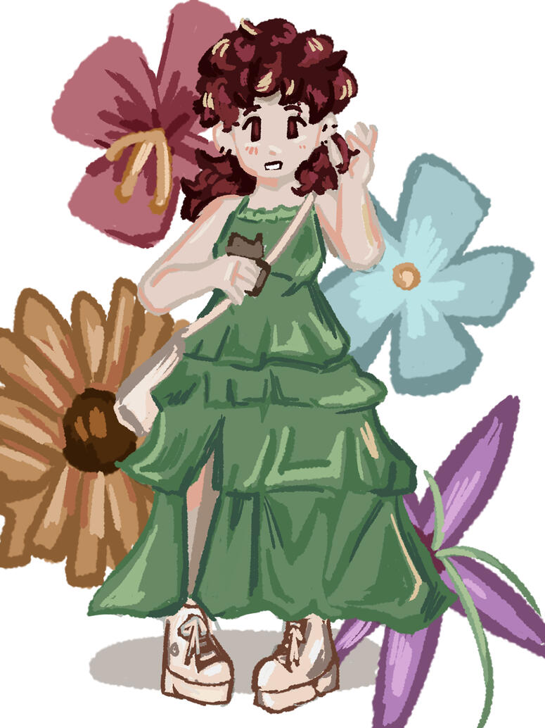
Flowers Vol I

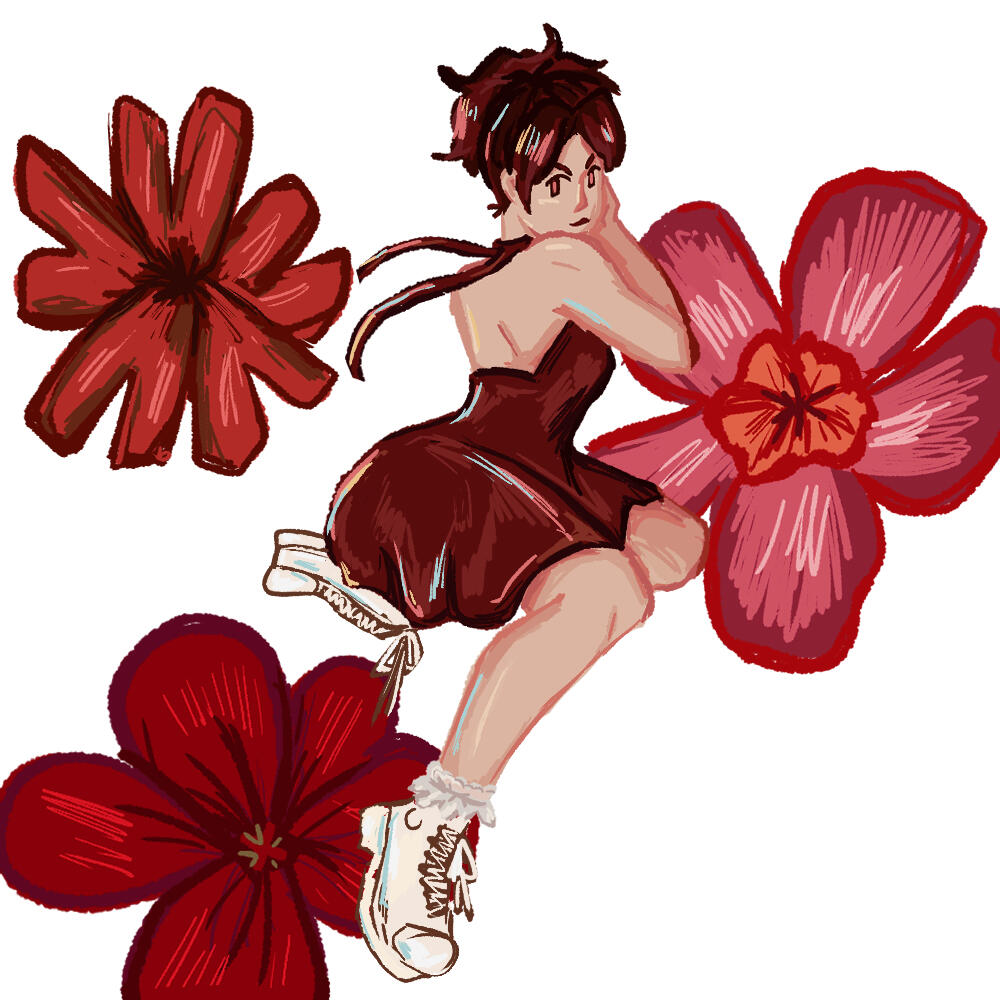
Flowers Vol II

Auster
Contact!!
Thanks 4 the interest!
Want to hire me? First: contact me!
currently closed !!
All of my artwork from
2-D Design

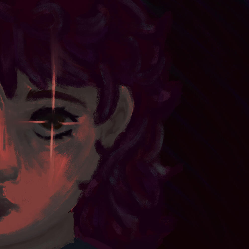
Red at Night


MIND RHYTHM

Natasha Tyler
Mind Rhythm
Ink on Bristol
11x14
My inspiration for this piece was The Strokes album Angles. My source image was Mercury Lulling Argus to Sleep. I really enjoyed the checkered pattern and I wanted to have lots of silly lines. This piece is meant to show the mind when listening to music. Whenever I listen to music or feel strong physical sensations (like piercings) my brain will make patterns and lines just like this. I started with an outline of my boldest outline, then the rest was just in pen no sketch.I loved having the negative space as my focal point and having lots of lines in the background. It feels a lot like how my brain works. This isn't very different from my usual process since I often pen sketch. This work reminds me of a younger version of myself because I would love getting new microns and I truly felt like a real artist when I used them.
WIP

La Viva en Puerto Rico

Natasha Tyler
La Viva en Puerto Rico
Mixed Media on Canvas
11x14
When starting this piece, I knew I wanted a lot of texture and variety, but I was overwhelmed and didn't have a clear goal in mind. When reflecting back on Puerto Rican culture I considered the aspects and items that I and my family often use or see. I knew that I wanted to have lots of floral detail and I wanted to paint my favorite sights within San Juan. I figured out from the beginning that I wanted to include a typical house that you'd see in San Juan and I wanted to include a bomba dancer in grayscale. Once I knew those key aspects, I thought about other items and culturally significant elements of Puerto Rican Culture.When researching different patterns and techniques I felt really inspired to include impasto texture. I was very satisfied with my impasto flower, coqui, and building design. The more I thought about home the more ideas of elements and aspects came to mind. I wanted the piece to be loud and slightly chaotic because every single family event I've ever been too has always been loud, hearty, and colorful. So to showcase that rhythm in my piece I've utilized lots of overlapping and color variety. I tried to not have too many repeating patterns because I wanted my piece to be unique.
WIP
